Showing posts with label 2D Art. Show all posts

Thursday, December 15, 2011

Matte Painting....yeah.....

Not gonna lie I really disliked this unit. It seemed an illogical next step for these thumbnails we've been stuck with since the midterm. I did however think that the final outcomes were pretty neat. I would have wanted to work on it more but I doubt I will unless I want to freshen up on skills.

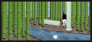
If you can't tell this is the lame green bamboo thumbnail. You can see how it progressed from the first attempt at getting textures and junk in to what ended up being my final pass at it.
The other part of the final for this class is another reworking of the midterm thumbnails, but I couldn't do much of anything with them because last time I merged the layers stupidly thinking I was done reworking them for homework, so I don't know if I will be uploading them.



2D Art Redo-Midterms That I Never Posted

I don't know how I forgot these....Oh yeah...I was very disappointed in only getting half of them done how I wanted. Freaking tech problems, I started over from scratch like three times. The ones I actually got to do digitally I am happy with for the most part. The other four almost look worse than what I had them on the original midterm but that's because they pretty much just went back to sketchbook form.


Sunday, November 20, 2011

Thumbnails


I guess we were supposed to redo our midterm thumbnails in digital values, but the homework I saw said to do new ones so that's what I did. I know they could use some more work, but overall I like them and am impressed with myself as before this assignment I had no experience whatsoever in creating art like this through photoshop.

Saturday, November 5, 2011

2D Art Midterms!


We had to pick eight images to refine even further and then put them in a fancy template. I'd say I managed to make some fairly decent improvements. Not gonna lie, I did rush a bit.

2D Art Midterm Pre-Final Version


We had to color the thumbnails again. So I did. They were better than the first run through.

Monday, October 17, 2011

Colored Thumbnails


I don't think I did so great on these, but I think the fault lies more with my poor orginal images. I still felt that progress was made from the first to last. Kinda wish I got a redo on this whole assignment because I could do it much better now.

Saturday, October 15, 2011

Environment Thumbnails


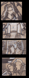
These first three were of a closet of a character of mine.


The three above are a city from a story I wrote.


These three were of a tunnel entrance from the same story.


This set of three was of some ruins.


The last three are a of a bamboo forest.
I feel like I did so-so with these. I don't think I did them correctly either. It seems like we were supposed to do these in the same way we did the ice castle exercise, but I did them more like the second class exercise and made them more specific and sometimes without objects to show scale. I still like most of them though.

Sunday, October 9, 2011

2D Art Class - Week 3

The finalish version of the environment thumbnail exercise.
Ran out of time and didn't get to fully render it.
I think my scene was a trap.


After looking at all the castles, is a more detailed thumbnail, tainted by marker bleeds.
Also on the page is the class exercise with the random scene. Unfortunately, you can't really see it because of my Character Viz homework on the back bleeding through.


So yeah...we had to make icy bendy castles or whatever.
Here's my attempt.

2D Art Week 2 Assignments (Part 2)

We had five minutes to do movie still thumbnails. 10 for each movie.
This is page one movie one. Beauty and the Beast.


Page two movie one. I will not lie,
I spent more than five minutes on most of these.


Last two of movie one and first two of movie two. Scott Pilgrim vs. The World.


Page two movie two. These I actually tried finishing in five minutes.
Note the change in quality hahaha.

Page three movie two.
Live action movies are much harder to do this for than with animated ones.

We were told to put frames around them but the ones I made in marker were too ugly. So I added better ones in photoshop and cropped them to make them more like strips than pages. It would have been a better idea if all my boxes were the same size and shape. Grrrrr, oh well I tried.