The third character for this assignment is Tyler Reinhart, the brother of hero Terra. He is a somewhat rebellious student who is having troubles adjusting to life without his parents. He collects superhero memorabilia, and always has a pocket knife on hand. Total amount of time spent on Tyler is even less than The Wolfman, I wanna say around 8-9 hours.This kid keeps getting the short end of the stick on this project. I always put him off until the end and get frustrated at how I can't work fast enough, and so he ends up looking the worst of all three. He has made major improvements from both the midterm and the first version of his character sheet. I feel he is still in the "has potential" stage of his development, but I could grow to like him.
The Barfing Squirrel
Art from an awesome squirrel (a.k.a me an aspiring character designer/artist)
Monday, December 19, 2011
The Wolfman
This is the villain character. He is an assassin who goes by "The Wolfman" in reference to the mask he wears, and is part of a secret league of mercenary assassins who all wear different animal masks. The character is inspired by a random sighting of a person on a motorcycle actually wearing a wolf mask, I thought it was pretty interesting of course. The total amount of time spent on The Wolfman is unknown, I would guess somewhere in the realm of 10-11 hours. Again I am very slow and need to work on speed. But I think I at least deliver good quality work. Honestly the only reason I am not farther on him is because of a twelve hour snag I hit doing my hero character. This is why The Wolfman has yet to get a model sheet.
Terra "KillShot" Reinhart
This is my hero character. Her name is Terra "KillShot" Reinhart, and she is a bounty hunter/new age superhero. I spent the most time of all my characters on her and she is the one I am most proud of. The only thing I am not completely happy with is the model sheet. Some of the views aren't completly accurate. In total I spent roughly 24 hours on all her pages. I have a problem with everything having to look perfect, or as perfect as I can get it, and it can make my timing go seriously awry or even make what I'm doing look worse.

Thursday, December 15, 2011
Matte Painting....yeah.....
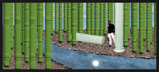
Not gonna lie I really disliked this unit. It seemed an illogical next step for these thumbnails we've been stuck with since the midterm. I did however think that the final outcomes were pretty neat. I would have wanted to work on it more but I doubt I will unless I want to freshen up on skills.
If you can't tell this is the lame green bamboo thumbnail. You can see how it progressed from the first attempt at getting textures and junk in to what ended up being my final pass at it.
The other part of the final for this class is another reworking of the midterm thumbnails, but I couldn't do much of anything with them because last time I merged the layers stupidly thinking I was done reworking them for homework, so I don't know if I will be uploading them.
2D Art Redo-Midterms That I Never Posted
I don't know how I forgot these....Oh yeah...I was very disappointed in only getting half of them done how I wanted. Freaking tech problems, I started over from scratch like three times. The ones I actually got to do digitally I am happy with for the most part. The other four almost look worse than what I had them on the original midterm but that's because they pretty much just went back to sketchbook form.
Saturday, December 3, 2011
Simple User Interface
So I decided that this blog will no longer just be assignments from Character Viz and 2D Art but really all my major classes and just my art in general.
I thought I'd start off this by posting the latest assignment for 2D Motion becuase I just liked it so much. It's a simple ten second user interface designed in After Effects. Some of the timing is off because I'm still getting used to how aftereffects renders in real time. Other than that I kinda like it. Credit for the original backround image goes to whoever made this. I found it on some desktop background site.

Sunday, November 20, 2011
First Color Ever

Seriously. Forget all the improvements and changes it needs, I'm just excited about how not terrible it is for my first coloring job ever in photoshop. This overall was a very cool and fulfilling assignment and something I look forward to doing in the future. Forgot to time this unfortunately. Spent roughly 5 hours I would say. So much more was spent on the inking than the actual coloring.
Subscribe to:
Comments (Atom)


